
Posted on 2021-01-26
As a graphic designer, it is important to know which software to use for which technique and specialty. Adobe Photoshop is used for creating raster images, better known as photographs and pixels. Adobe Illustrator is used for designing vector graphics, also known as limitless sizing abilities of cartoons and illustrations. The next major designer’s tool is Adobe InDesign. When it comes to becoming a master of desktop publishing, typesetting, and page layout, look no further than this powerful software.
Adobe InDesign was initially released in August 1999 to create posters, flyers, brochures, and publications. The most important thing to consider about InDesign is that it is the spatula that spreads the bread and butter of desktop publishing. Illustrator and Photoshop are used to create the graphics for your publications, the bread and butter. Import these elements into InDesign, the spatula, and properly incorporate them into your layout.
Now that we understand what the purpose of Adobe InDesign is, let’s focus on a few important tools that can be extremely beneficial to your designs. The first factor I wish to focus on is your Master Pages. In large publications, it is crucial to know and understand master pages, if you have many pages that require the same layout. For example, you may want all your pages to display the page number. You can do this by going to Type – Insert Special Character – Markers – Current Page Number. Now, maybe you want some of these pages to have different fonts. You can simply create another Master Page and assign it to the designated pages you wish to display differently. Double click on the proper master page in the pages panel and change it accordingly. With enough time and practice, you will soon be a master of Master Pages!
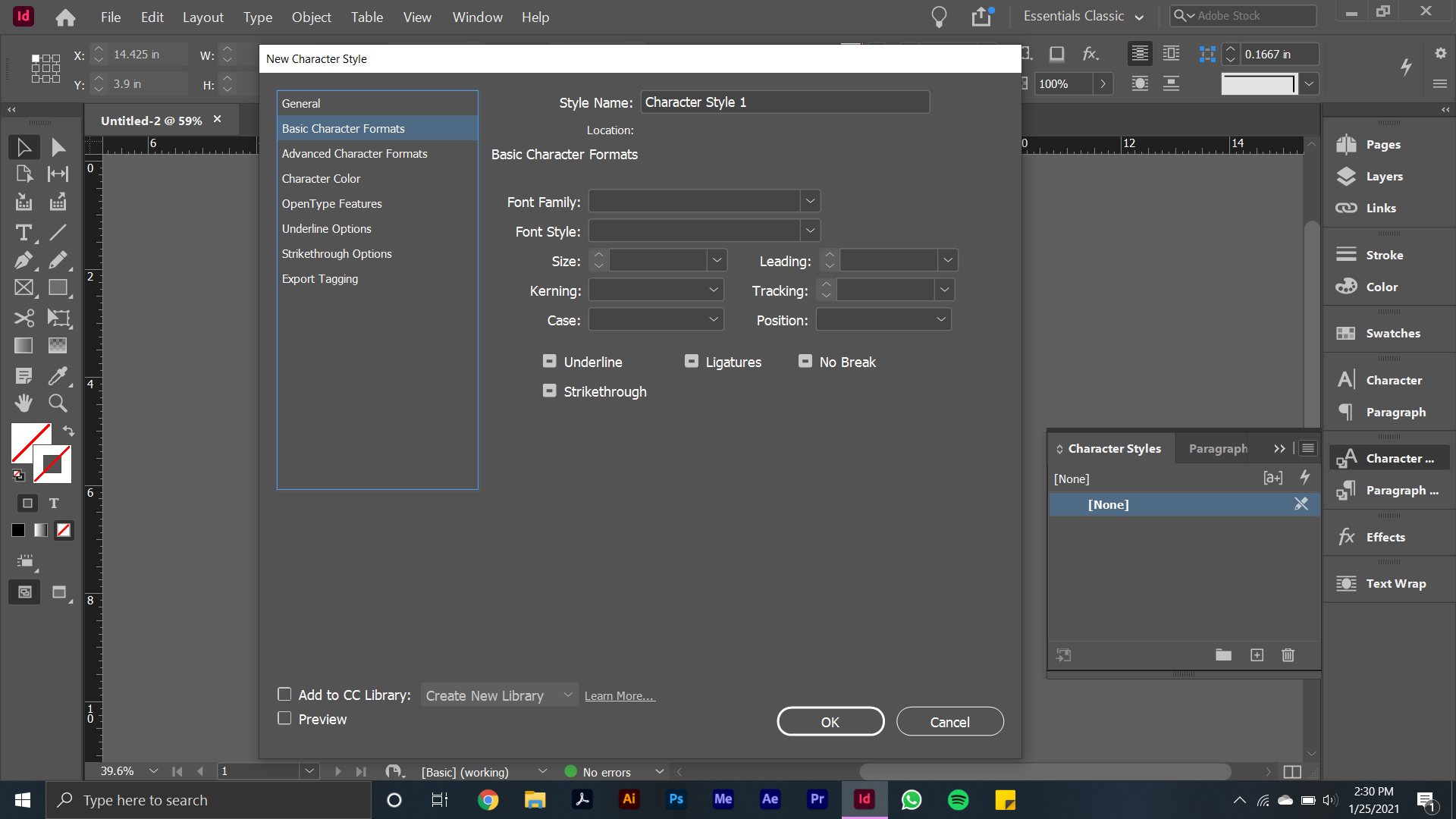
Have you begun your desktop publishing with the goal of wanting to assign specific font sizes and families to specific areas of your design? Thankfully, that is where our character and paragraph styles come into play! Character styles are what we use to identify specific font sizes and families to your layout. A simple example is using a specific font for a headline, while using something different for body copy. Go to Window – Styles – Character Styles to pull up the menu for this option. We can save paragraph styles for the next lesson.
Do you have a vector graphic or raster image that you want to include in your layout, but want it to wrap around your block of text? Thankfully, we have the text wrap tool for this exact purpose. Place your designated graphic where you want it to wrap around your text, displayed on top of the words. Go to Window – Text Wrap to display your window to make a text wrap. The simplest solution for a test wrap is option #3, which is “wrap around object shape.” Under contouring options, you can select the type as “select subject.” As seen in Adobe Illustrator, this line has anchor points. We can use the direct selection tool to select these anchor points to perfect our text wrap exactly how we want it! Now, you may notice that some of your body copy has disappeared, and there is a red box in the corner of the text box. This means there is still type in this box. Simply click the red box, and you can continue the type onto the next page, or wherever else you wish to display it!
By understanding a few of these basics of Adobe InDesign, you should be able to successfully accomplish and layout a simple page layout design with ease. Stay tuned for more lessons from your Creative Director of Design and Print here at SunSpin Media!